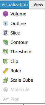
Visualization
Tomviz provides a hardware accelerated visualization engine connected to a data pipeline. Upon loading data a default volume rendering will be shown of the data. Once transforms are applied to the data, visualizations will move to the output of the pipeline automatically.
It is possible to visualize the original data by selecting the source node and adding desired visualizations to it. Data can be cloned, which will create a new source node with a copy of the selected data.
Tomviz saves its state every five minutes which can be recovered when Tomviz next starts should the application crash or the computer have power issues. You can also save the application state by taking a snapshot of the pipeline at a given moment. See the data section for more details on loading/saving data and/or state.
Techniques
In this section, we will go over some available techniques and explain the important parameters. Most of the techniques are GPU accelerated, which requires a good graphics card that has at least 2GB memory, and ideally 16GB of system memory. Larger volumes will require more data, see data section for some discussion of typical data sizes.
Visualizations
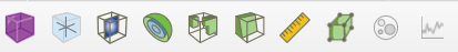
Visualizations are implemented in C++ using GLSL to take full advantage of
hardware acceleration. They are available from the Visualization menu and
the toolbar, and operate on the volumes loaded/processed in the application.
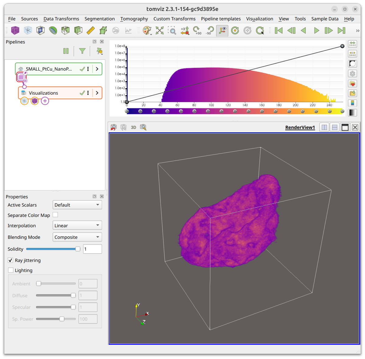
Views of loaded data
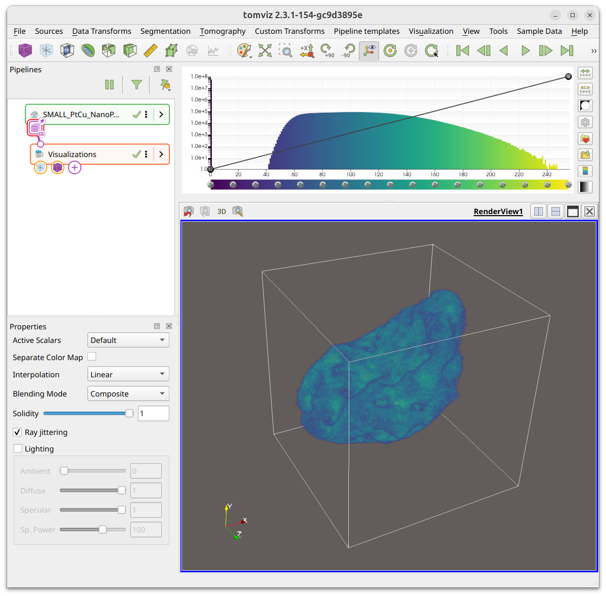
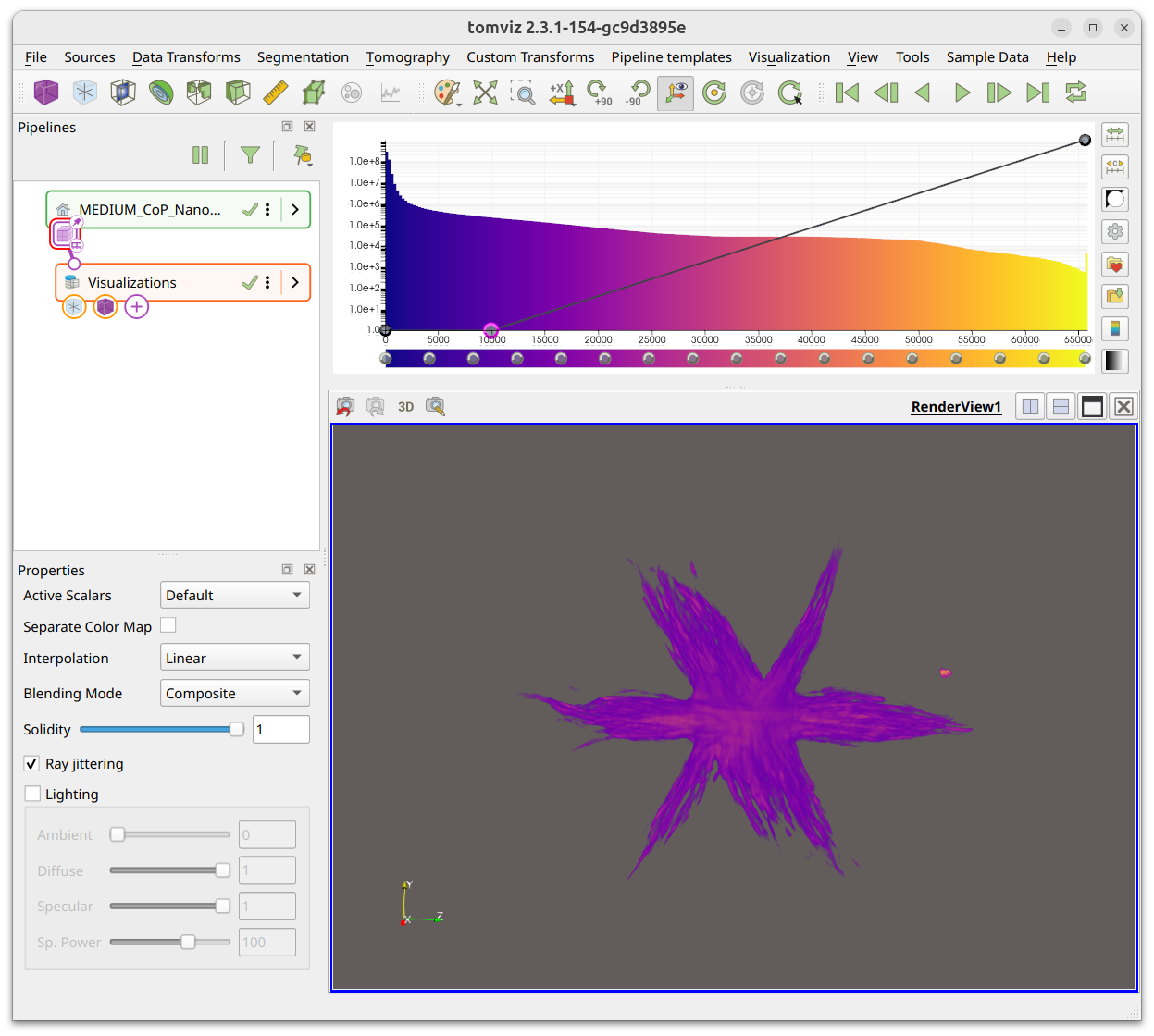
When Tomviz opens data it has a number of defaults. The screenshot below shows
a typical view of a volume loaded, with a volume rendering and the default
Plasma color map. The histogram and opacity transfer function are displayed
in the top-right.
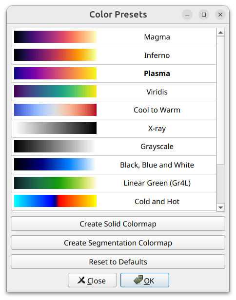
Palette and background colors
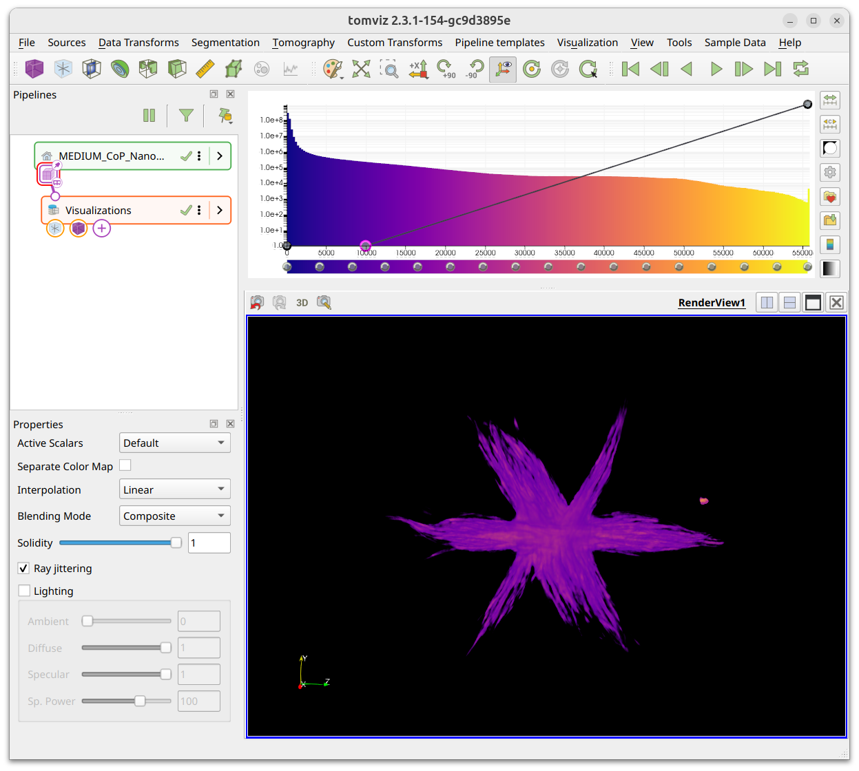
The color palette can be modified using the button shown, and has several useful presets. The default palette can also be changed if preferred.
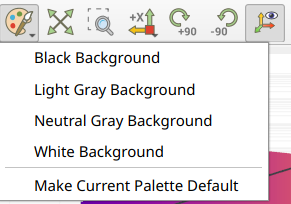
The black background is recommended when displaying on monitors, or in some presentations, white is often better for print, web pages and etc.
Color maps
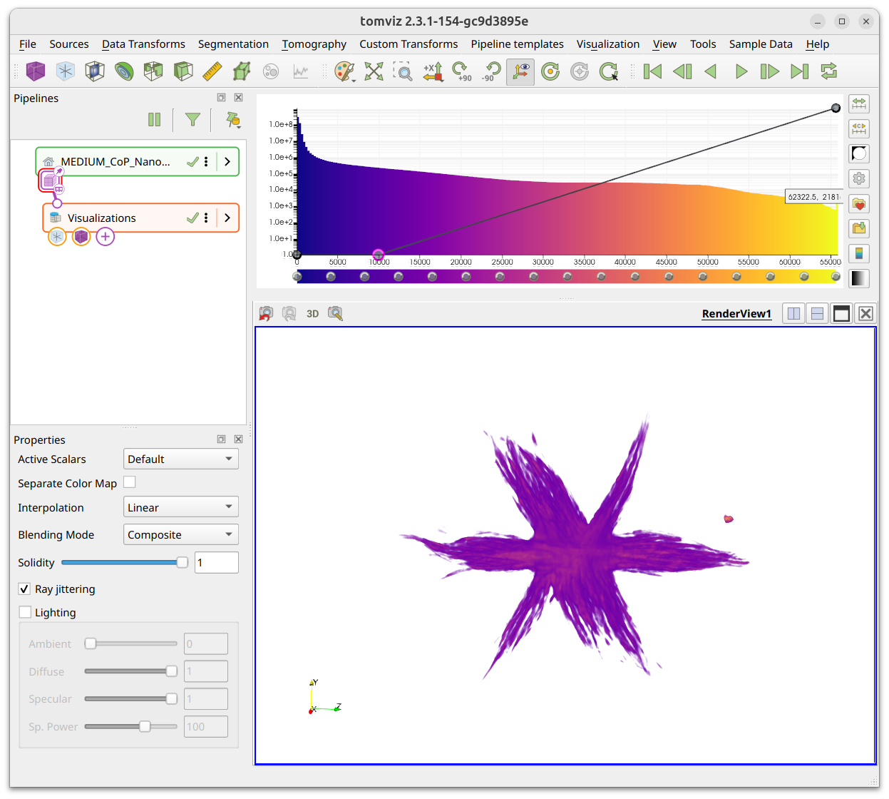
Plasma is the default color map, but the application contains a number of
alternative color maps that can be used. You can invert the color maps, and also
create custom color maps that can be saved for future use.
Selecting Viridis will result in the view being modified as shown, different
data can benefit from some of the alternate color maps.
Contour
A contour along a single isovalue can be displayed in the application by adding a contour visualization. The properties panel has a slider where the isovalue can be specified; a few example contours are shown below at different isovalues. Note how the color is set by the color map.
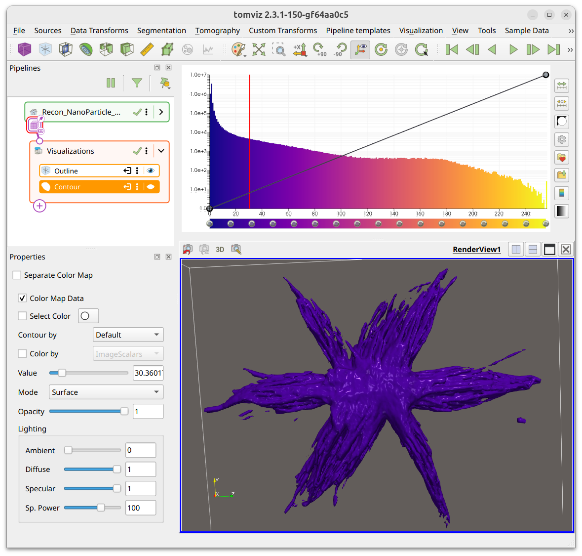
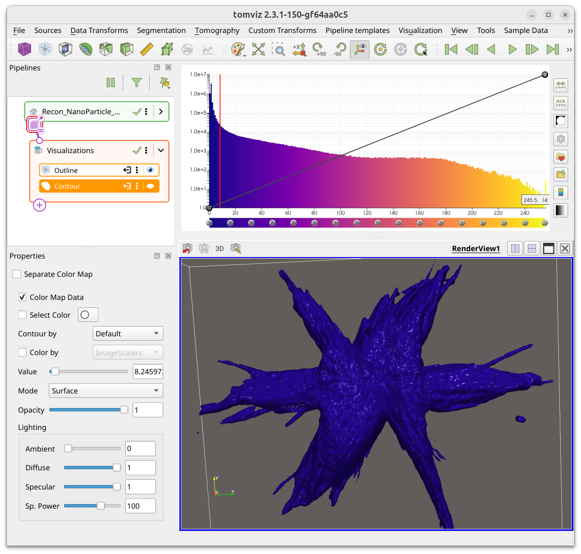
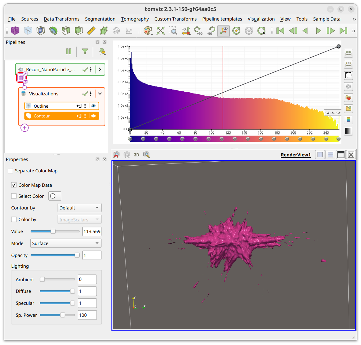
The contour properties include Mode (Surface or Wireframe), Lighting
controls (Ambient, Diffuse, Specular, Specular Power), and the option to use a
Separate Color Map. If multiple scalars are available on the data, you can
select both the scalars to Contour By and the scalars to Color By.
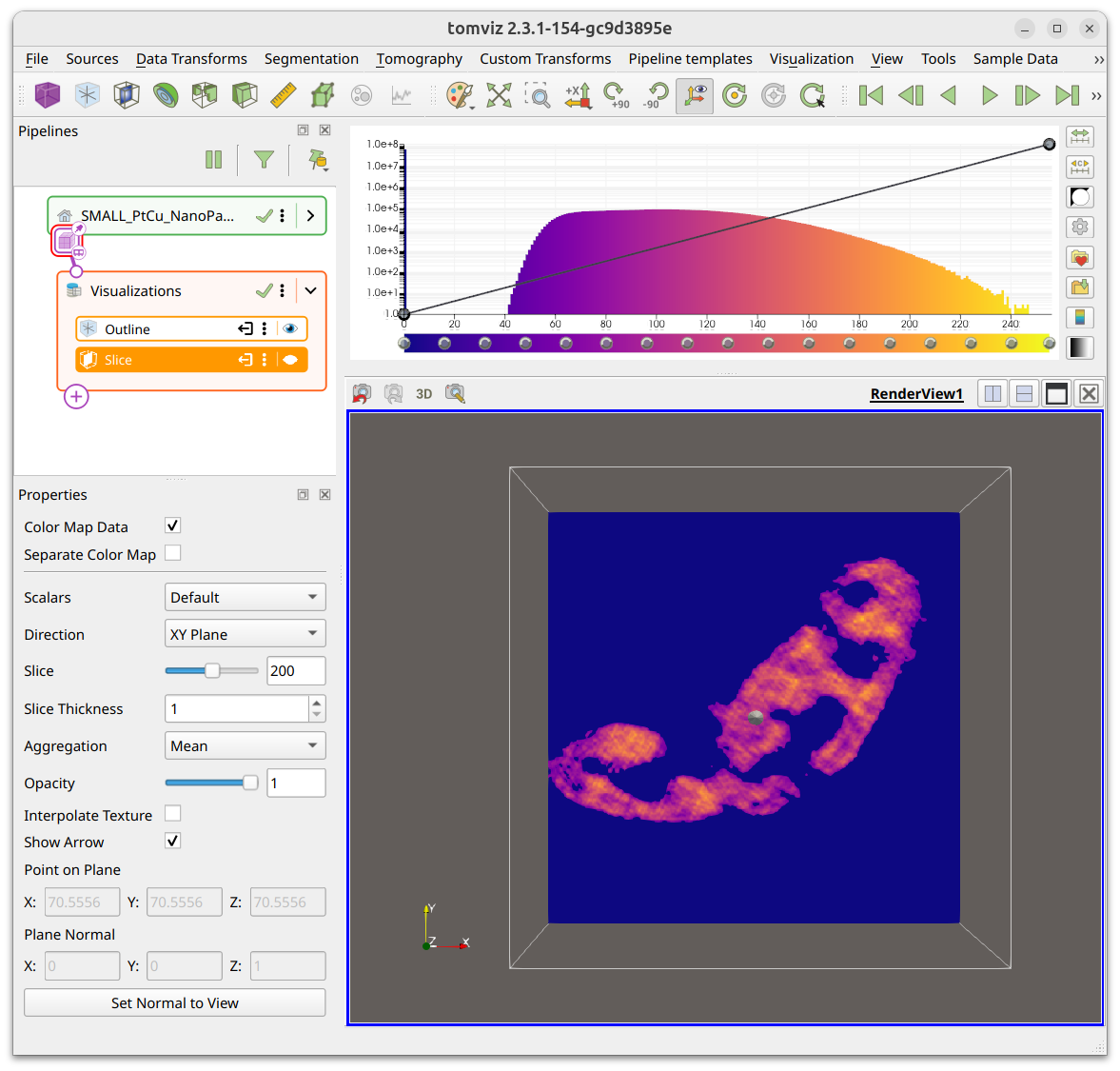
Slice
Slices through the data can be added with the Slice visualization. The default
is to show an orthogonal slice along the XY plane, as shown below. The
properties panel lets you choose the Direction (XY, XZ, YZ, or Custom),
adjust Slice Thickness, toggle Interpolate Texture, and set the point and
normal of the plane.
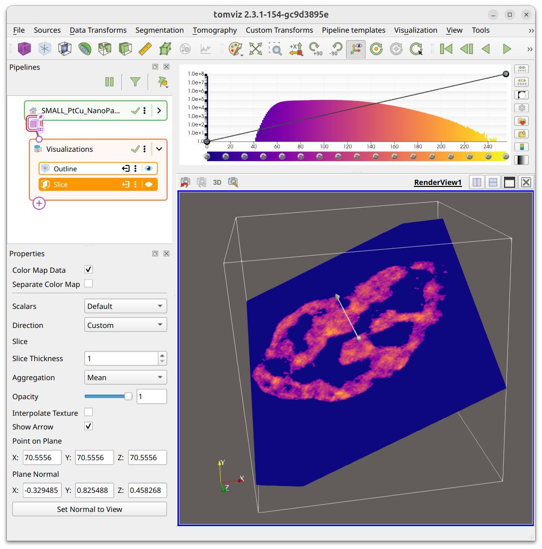
You can set the direction to Custom in order to slice through at any angle.
In custom mode, additional properties such as Slice Projection (Mean, Min,
Max) and Opacity are available.
When loading tilt series data, a slice visualization is shown by default to allow browsing through the projection images.
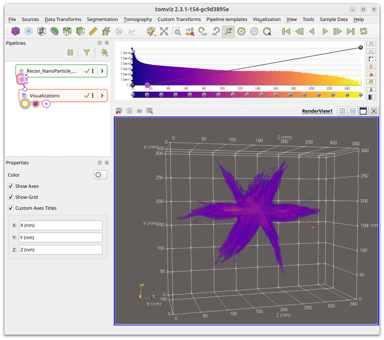
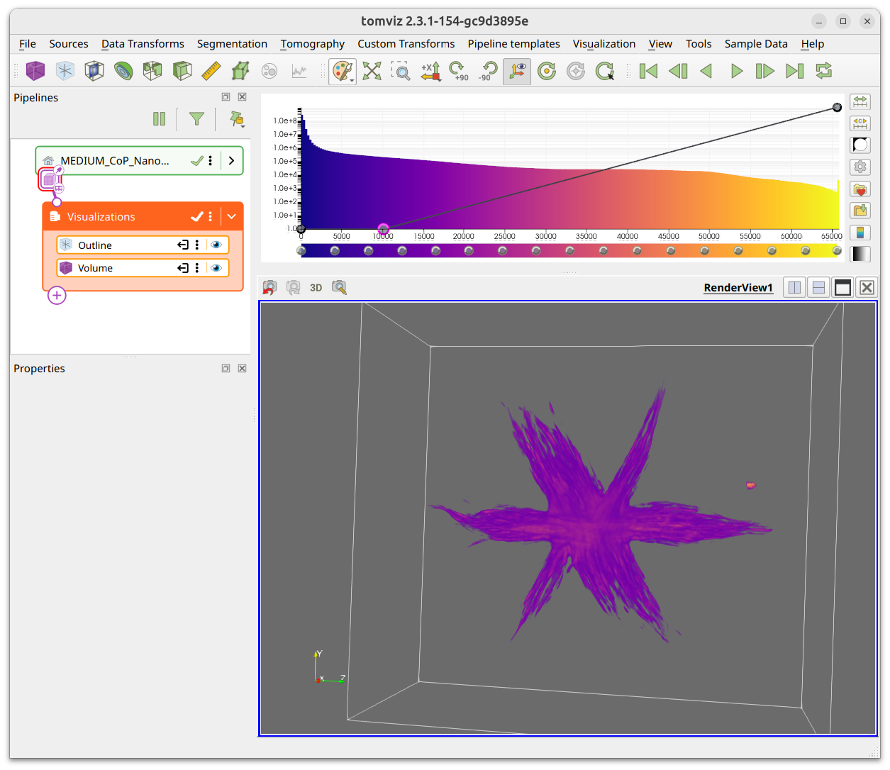
Outline
The outline visualization principally shows the extents of the volume, and can
be useful to see how far the volume extends. The properties panel includes
Show Axes, Show Grid, and Custom Axis Titles options. The screenshot
below shows the outline with axes and a grid enabled, with custom axis labels.
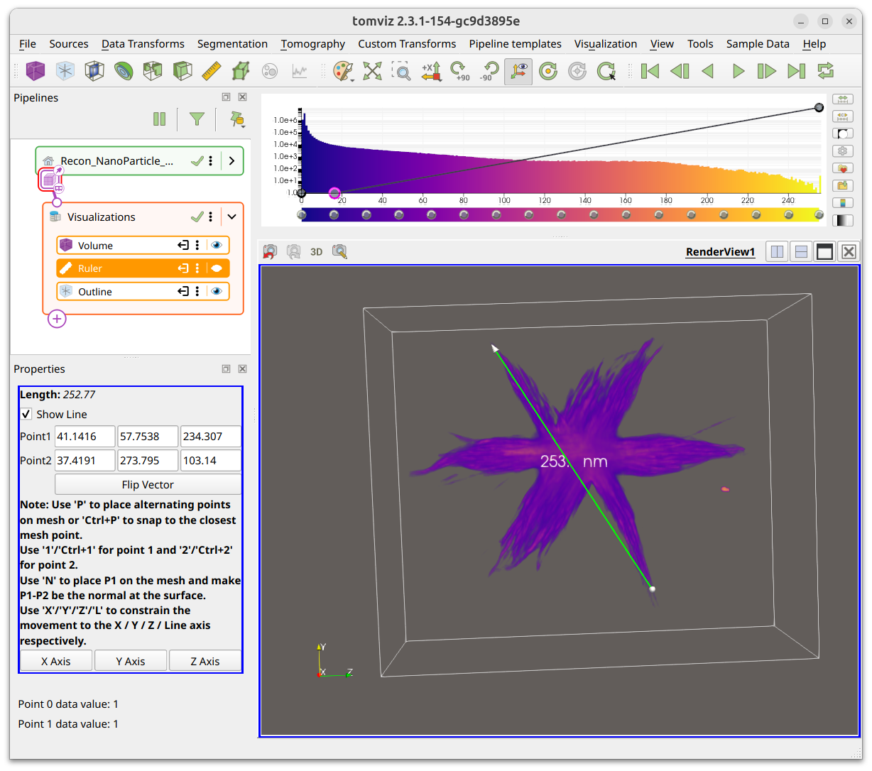
Ruler
Rulers can be used to measure distances in the scene. The properties panel
displays the length and coordinates of the two endpoints. Use P to place
alternating points on the mesh, or 1/Ctrl+1 and 2/Ctrl+2 for the
individual endpoints. Use X/Y/Z to constrain the ruler to an axis.
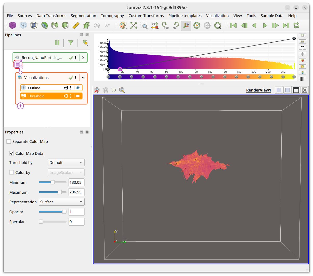
Threshold
The Threshold visualization will display all voxels between the specified
minimum and maximum values. The properties panel includes Minimum and
Maximum sliders, Representation (Surface or Wireframe), Opacity, and
Specular controls. Like contours, thresholds support Threshold By and
Color By when multiple scalars are available.
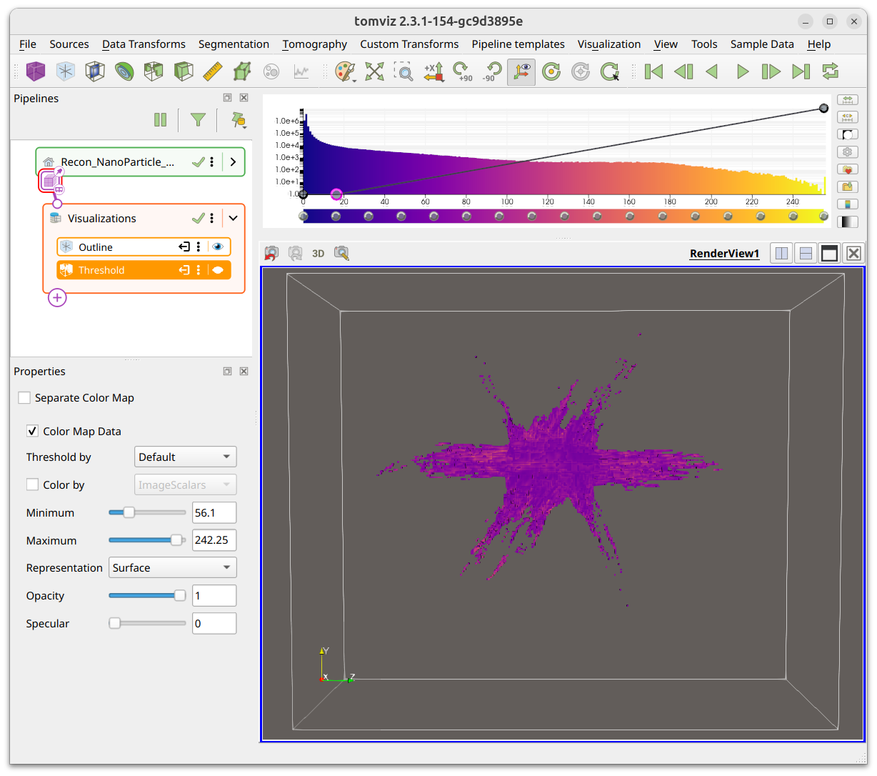
The two screenshots show two distinct ranges as selected in the properties panel.
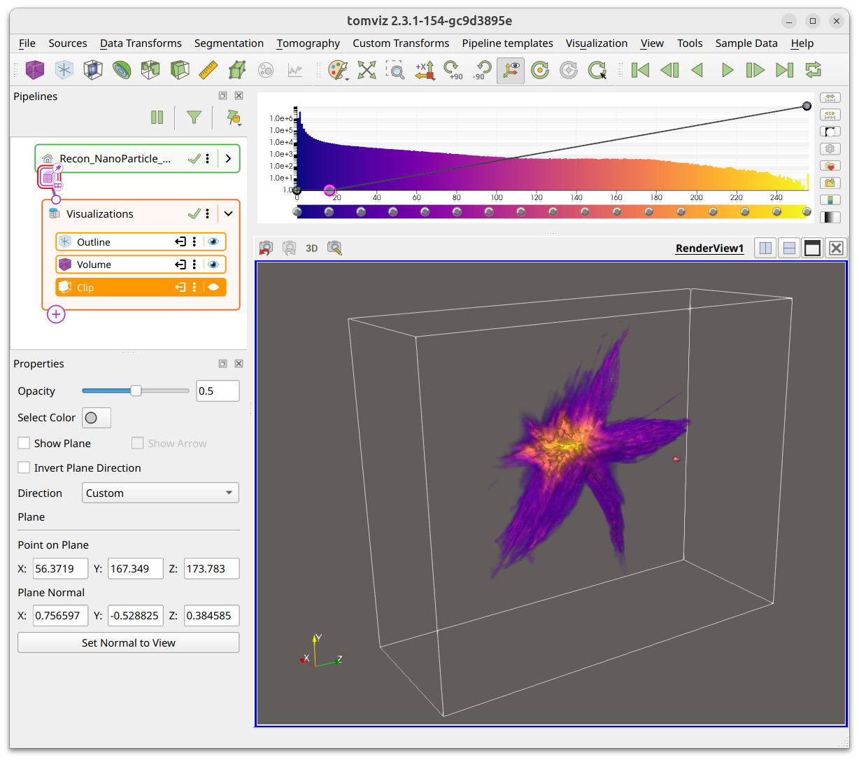
Clip
Clipping planes can be added to the data in order to clip any applied Slice,
Volume, or Contour visualizations. The default is an orthogonal plane, but
its direction can be changed and the plane can be inverted to allow for clipping
from any direction. The properties panel lets you select the plane color, toggle
Show Plane and Show Arrow, and choose the Direction.
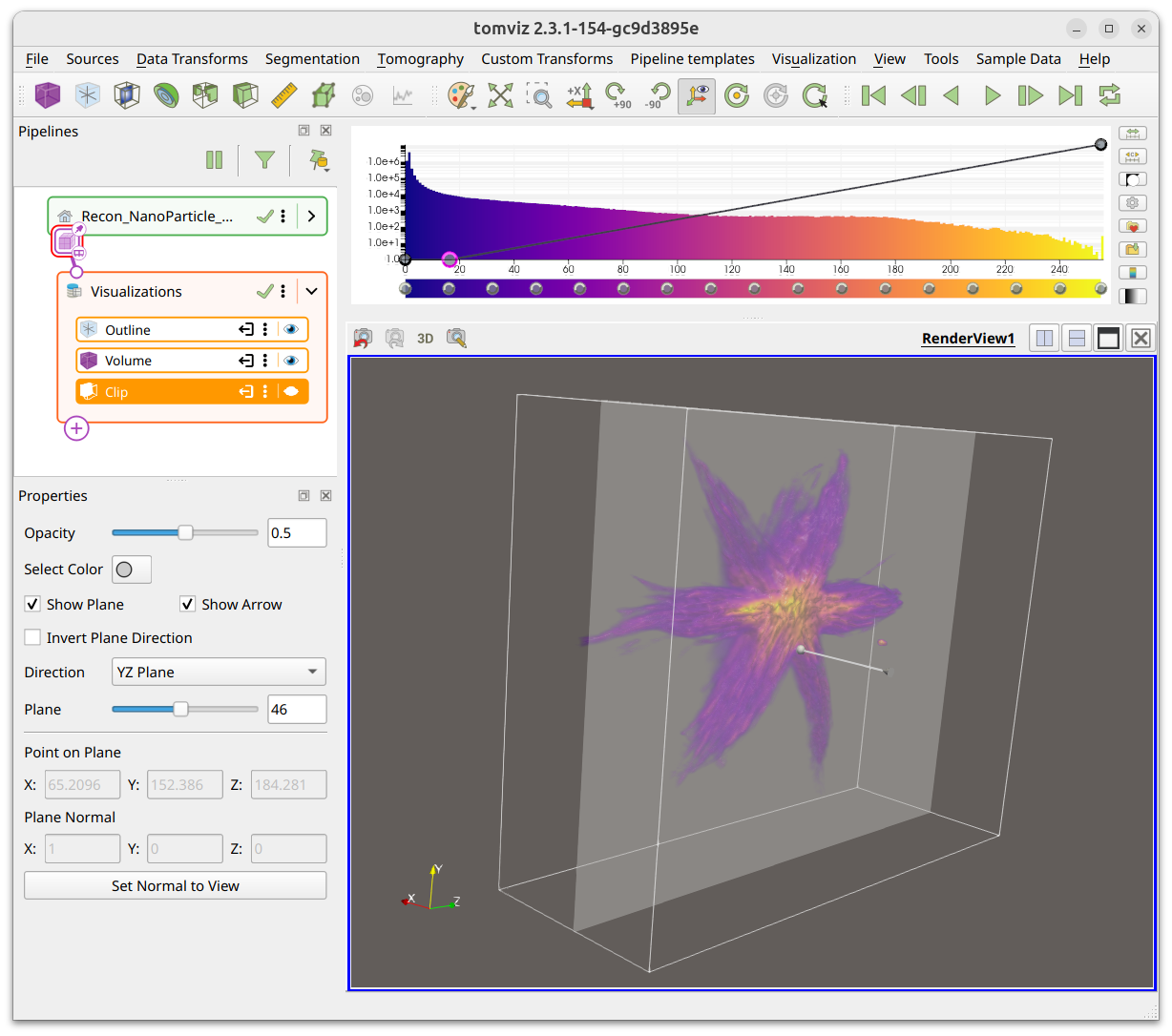
The direction can be set to Custom to clip at any angle. The point on the
plane and the plane normal can be set numerically, or you can click
Set Normal to View to align the clip plane with the current camera direction.
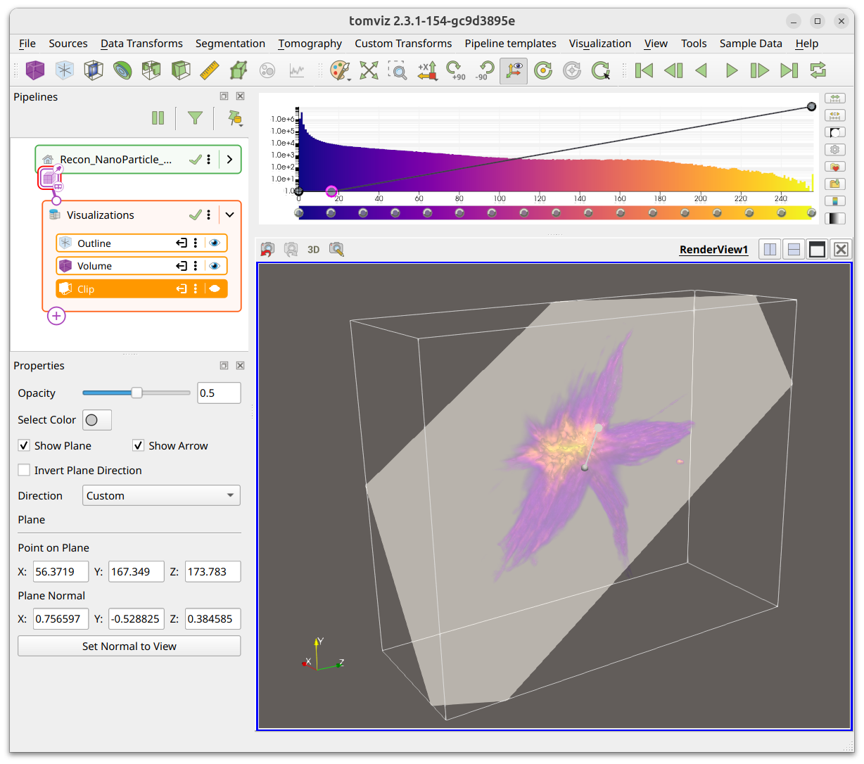
The plane and arrow can be toggled off for clearer views of the clipped data.
Color Bar and Opacity Editor
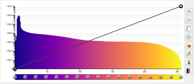
The color map, histogram, and opacity function are combined in the widget in the top-right corner of the application display. The color map works primarily with the slice visualization and volume rendering, and the opacity function works primarily with volume rendering.
The rectangular bar at the bottom is the color bar. New nodes can be added by clicking the color bar, nodes can be deleted via the “Delete” key, they can be moved by dragging them, and they can be re-colored by double left-clicking them.
The line at the top represents the opacity function. New nodes may be added by clicking on the function, they may be deleted via the “Delete” key, and they may be moved by dragging them. Nodes can be dragged up (more opaque) and down (less opaque) and side-to-side to change the scalar value to which they apply.
Color Space
The color space may be changed by selecting the gear icon on the right side of the histogram.
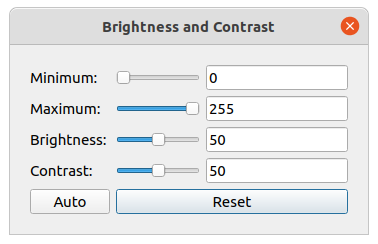
Brightness and Contrast
The brightness and contrast may be edited by selecting the grayscale icon on
the right side of the histogram. This is primarily intended for grayscale
color maps, but can be used for other color maps as well. The dialog shows
Minimum, Maximum, Brightness, and Contrast controls.
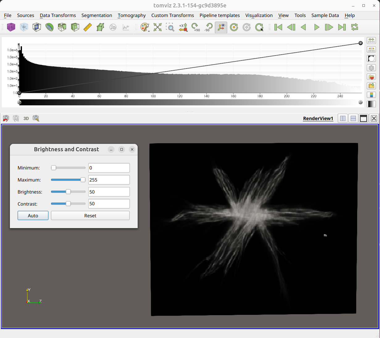
Adjusting the brightness shifts the color bar left and right. Adjusting the contrast makes the color bar width shrink and expand.
The Auto button automatically adjusts the brightness and contrast to the
data range based on certain thresholds. The Reset button restores the
original values.
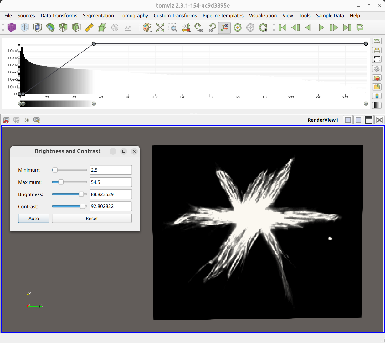
Repeatedly pressing Auto increases the threshold that is used, and thus
increases the contrast as well.
Volume Rendering
Tomviz uses volume rendering provided by VTK that utilizes graphics processing units (GPUs) to accelerate rendering and achieve maximum performance. It needs to upload the volume as a 3D texture, and offers a number of rendering options that will be described and demonstrated. The default settings of the volume renderer with the default color map and opacity look like the image below.
Color Map and Opacity
The combined color map, histogram, opacity function widget is closely integrated with the volume renderer.
The screenshot below shows the impact on the volume renderer of adding an opacity node, and setting it to zero such that all values below about 10,000 are fully transparent. This tends to remove most of the “background” values that dominate in the default image with just two nodes. The transparency linearly interpolates between points.
Background color
The color palette can be manipulated by clicking on the artist palette icon in the toolbar. The screenshots below show the white and black palettes and their impact on the volume rendering without any other changes.
Empty space and cropping
Making the outline visualization visible will show the total extent of the volume. Once we have found suitable opacity points it is clear that quite a bit of the space is empty.
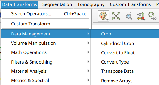
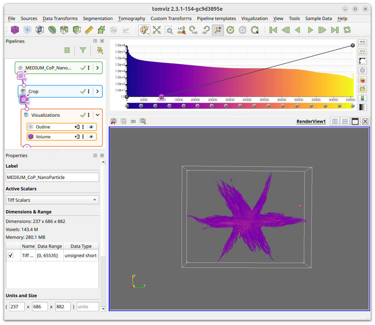
You can access the Crop transform from the Data Transforms >
Data Management menu, and interactively crop the volume. This can be done
numerically in the dialog or interactively in the 3D view. The screenshot below
shows an example of the crop transform in action.
The crop dialog shows the selected volume start and end coordinates as spinboxes. You can type the desired extents directly, or drag the spherical handles on the 3D crop box to move the planes in or out.

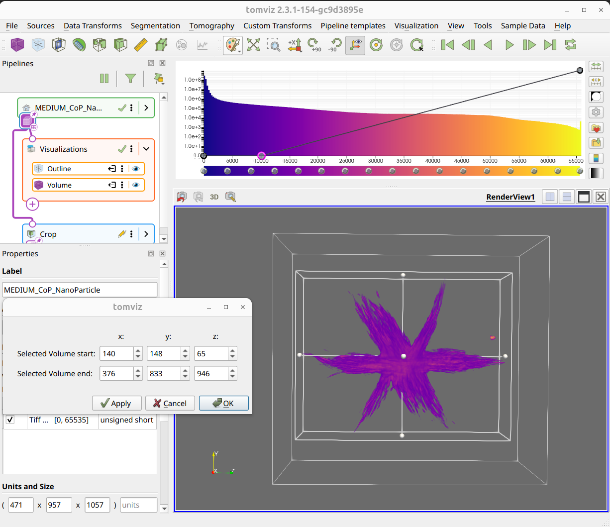
When the desired values are set, click OK to finish the cropping. You can
also click Apply to preview the result while keeping the dialog open, and
Cancel to discard changes.
Cylindrical Crop
In addition to the box crop, Tomviz offers a Cylindrical Crop transform
(also in Data Transforms > Data Management) for cropping the volume to a
cylindrical region with arbitrary axis orientation. See the
Cylindrical Crop section in the
operator catalog for details and examples.
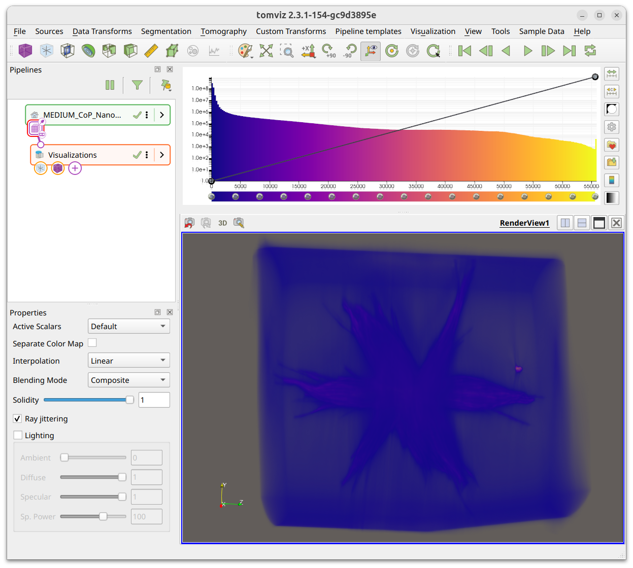
Rendering Properties
The volume renderer properties are in the properties panel when the volume visualization is selected in the pipeline. The panel is shown below with the default options selected.
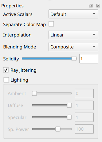
The properties panel includes Active Scalars (to select which scalar array
to render), Separate Color Map, Interpolation (Nearest Neighbor or
Linear), Blending Mode (Composite, Max, Min, Average, Additive), a
Solidity slider, Ray jittering toggle, and Lighting controls (Ambient,
Diffuse, Specular, Specular Power).
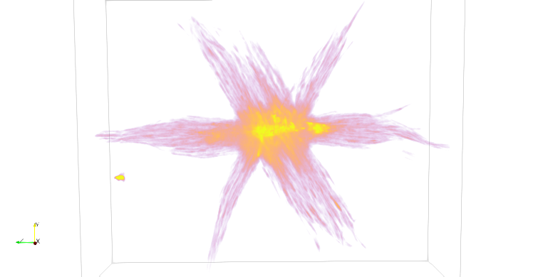
The following screenshots only modify the options in the volume renderer properties panel. The default options produce the following result:
Turning Ray jittering off does not look very different with this dataset, but
in others the jittering can remove what looks like a wood grain pattern.

Turning lighting on can have quite a marked effect, it adds shadows, highlights and other related lighting benefits. It often needs enough opacity to be used for the shadows and surface to offer the additional depth shown below.

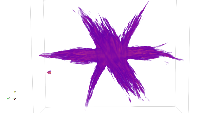
The Max blending mode (Composite is default) enables you to see
the core of the structure more easily. In this case there is a lot more high
intensity that is typically hidden.
Exporting Visualizations
Tomviz offers a number of options to export the visualizations created in the application.
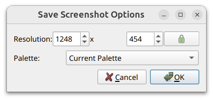
Export screenshot
From the File menu, you can choose Export Screenshot. The dialog lets
you specify the resolution of the image and the color palette. You can use a
transparent background, which can be especially useful for presentations.
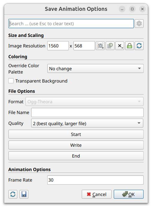
Export movie
The movie defaults to producing an orbit around the volume using the scene in
the current view. It is Export Movie in the File menu. The dialog provides
controls for image resolution, color palette, transparent background, file
format and quality, and frame rate. Use the Start/Write/End buttons to
capture individual frames, or simply click OK to render the full orbit
animation.
Plot Visualization
The Plot visualization provides interactive line chart displays for tabular results produced by transforms. Transforms such as Power Spectrum Density and Fourier Shell Correlation generate table-based output that is displayed as line charts in a dedicated plot view.
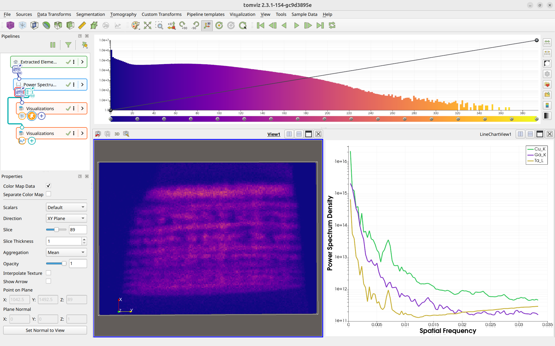
Adding a Plot Visualization
To add a Plot visualization, select a node that produces table output in the
pipeline, then click the Plot button in the Visualization toolbar. The Plot
will appear in the pipeline linked to the selected node’s table output port.
Plot Options
The Plot visualization supports several options for customizing the display:
Log Scale X - Toggle logarithmic scaling on the X axis
Log Scale Y - Toggle logarithmic scaling on the Y axis
Axis labels are initially provided by the transform that generated the data, giving context to what is being plotted. The axis labels are also editable, allowing you to customize them as needed.
Plot Colors
When multiple data series are displayed, the plot uses automatically generated colors based on HSV spacing. This produces a large number of visually distinguishable colors, making it easy to differentiate between many series.
Exporting Plot Data
Table results displayed in the Plot visualization can be exported as CSV files
for external analysis. Right-click the transform in the pipeline and select
Export Table as CSV to save the data.